Why the Campbell’s Soup Medal Is on Every Can

September 28, 2026
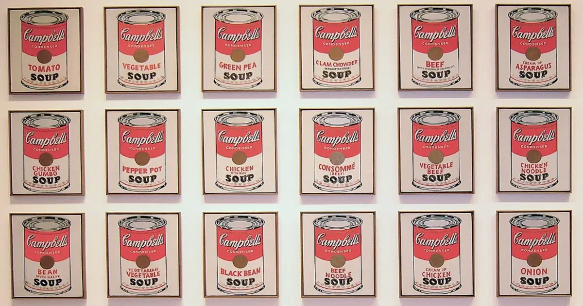
source: Brandon Fick / Wikimedia
The Campbell’s soup medal is that small round emblem near the top of the red-and-white label. It is the one I have looked at a thousand times in the cupboard without ever once reading it. Most shoppers do the same. It sits there in gold and dark red, ringed with words too small to bother with. This quietly implies that somebody, somewhere, decided this soup was very good. That part is true. What is surprising is how old the decision was. Additionally, it is surprising what it actually referred to.
It is not a modern quality stamp. It is a snapshot of a single afternoon well over a century ago, kept on the can ever since.
The Campbell’s Soup Medal Is Older Than You Think
The Campbell’s soup medal traces back to the 1900 Paris Exposition, the Exposition Universelle, where the company was recognized with a medallion for product excellence. That was the world’s fair era, when nations shipped their finest goods to Paris to be judged. A medal from the event carried real weight with the buying public.
The timing matters. This was right around when John Dorrance, a chemist working for the company, had figured out how to condense soup by removing much of the water. As a result, that made each can lighter, cheaper to ship, and far more affordable on the shelf. A young product with a fresh idea walked away from Paris with an award. The company was never going to let that go quietly.
One detail worth flagging: sources do not entirely agree on the medal’s color. Some describe it as gold, others as bronze. The award existed and the date holds up. However, if you want the exact metal, the record is muddier than the label suggests.
From a Paris Award to the Front of the Can
Winning was one thing. Putting the win where every customer would see it was the clever move. The medallion was worked into the label and into the company’s advertising, and it simply never left. Over decades of packaging tweaks, the emblem stayed put. It became as fixed a part of the red-and-white identity as the color scheme itself.
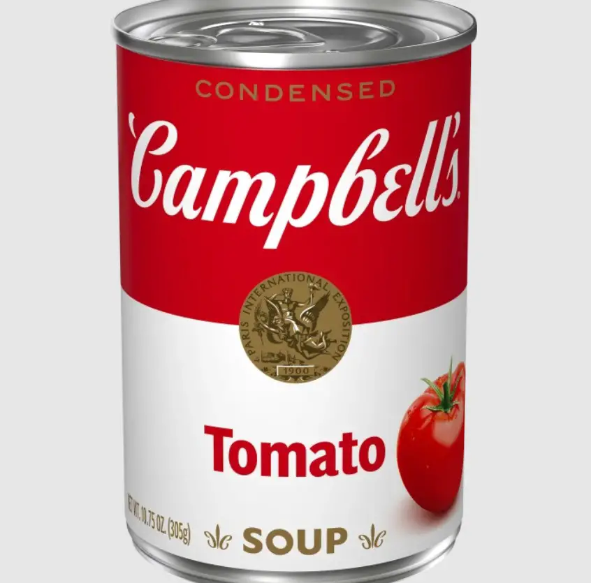
That is unusual. Labels are one of the most reworked surfaces in any store, and companies drop old flourishes all the time. Sometimes what stays, and what quietly vanishes, tells you more than the product inside. This is its own puzzle worth a look on pickle jars. Campbell’s went the other way. When the brand modernized its condensed soup packaging in recent years, a cleaned-up version of the same emblem stayed on the label. This was a deliberate nod to the 1900 award rather than a break from it.
What the Medal Does Not Mean
Here is where a lot of people quietly misread it. The medal is not a certification. Nobody is re-judging Campbell’s condensed tomato soup every year and reissuing the honor. It is not a seal renewed by an ongoing contest, and it is not a claim that the soup won something last season.
It is heritage, plain and simple. A historical award, roughly 125 years old if you count from 1900, preserved as a piece of brand identity. Think of it less like a fresh gold star and more like a date carved into a building. The building may have changed hands and been repainted many times, but the year stays because it marks a beginning.
That is not a knock on the company. Keeping the emblem is honest in its own way, so long as you understand you are looking at label design shaped by history, not by this year’s judges.
So the emblem you have ignored for years is really a small museum piece riding along on a grocery item. Next time a can is sitting in the cupboard, it is worth turning it in the light and actually reading the tiny ring of text. What you are seeing is a decision made in Paris in 1900. This decision has been carried forward through every redesign since. It is still doing its quiet job of telling you this soup was once, memorably, judged the best in the room.