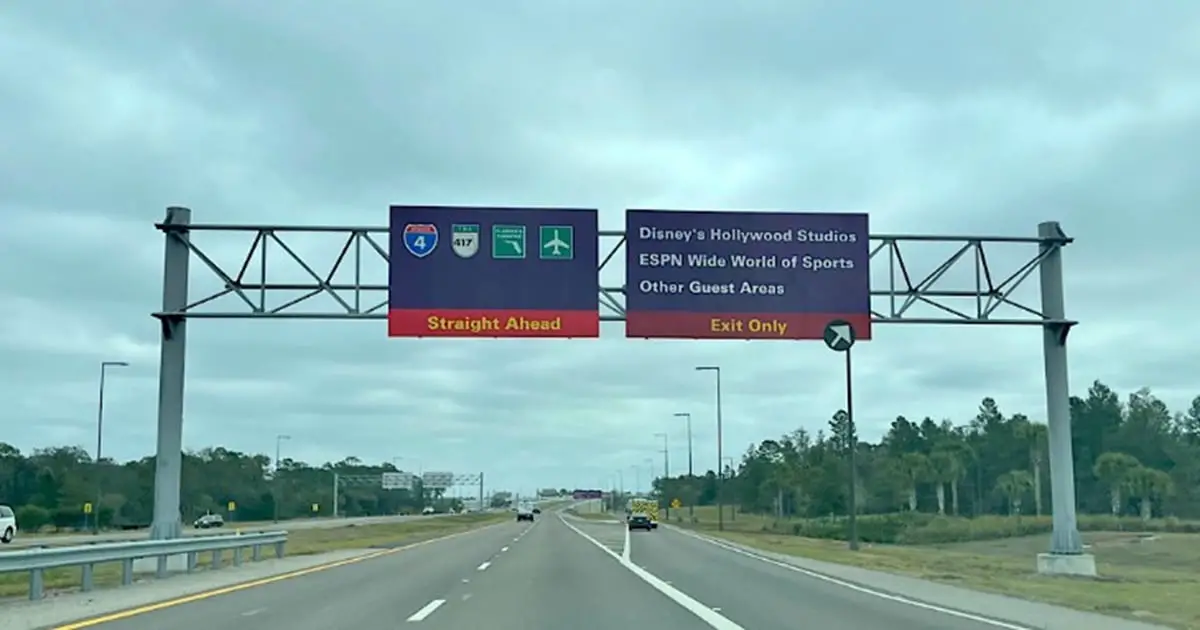
Drive toward the Disney parks in Florida. You will spot the purple road signs long before any castle comes into view. I always file them under “Disney being Disney” and keep rolling, the same way most of us do. But there is a real reason behind them, and it is more deliberate than a splash of theme-park color. The purple is a decision, not decoration, and once you know what it is doing, you cannot unsee it.
The signs have guided guests across the property for decades, and they do a quiet job most drivers never notice. That job starts with a color convention you already obey without thinking.
What Color a Road Sign Is Supposed to Be
On ordinary American roads, sign color follows a rulebook. The federal Manual on Uniform Traffic Control Devices sets the rule. Guide and directional signs are green. Warnings are yellow, construction is orange, and regulatory signs like stop and yield are red and white. Your eye learns these so early that you read the color before you read the words.
That is why an unusual color grabs attention. We have written about the meaning behind a blue stop sign and what it means if you see a pink traffic sign, and both work on the same principle: a color off the standard chart is telling you something.
Disney has room to play here, but only within limits. Wayfinding and destination signs allow flexibility for branding; the safety-critical signs, speed limits and stops, still follow the standard. So the purple shows up where it legally can, on the directional signs that point you toward parks and hotels.
The Reason Disney Went Purple
So why purple? According to trade reporting on the longstanding purple-and-red signage and its 2022 overhaul, the color was chosen to read as distinctly Disney and to mark the moment you cross from public highway into the resort. The classic Disney palette leans on Mickey Mouse colors: red, black and yellow. Purple sits as a complementary shade against them. A red stripe ran along the bottom of the old signs to tie the look together.
Worth being clear: no formal Disney press release spelling out this rationale is on file. The Mickey-colors explanation comes from reporting, not from the company. Treat it as the widely documented account rather than a confirmed corporate statement.
Even so, the logic holds up on the ground. Purple is warm, friendly and nothing like interstate green. It feels designed, which is exactly the signal a resort wants sending the second you arrive.
What the Signs Actually Do for Drivers
The color is not only charm. It is function. Walt Disney World covers roughly 40 square miles. It sprawls across parks, hotels and parking areas. Plain green signage would turn this into a maze. The purple gives the whole network a single visual identity. Your eye groups the Disney signs together and tunes out everything else.
There is a psychological switch too. The break from highway green tells you Disney’s rules now apply: speeds drop, traffic slows, and you shift into guest mode. That shift in behavior is useful before you have read a single word. It is the same kind of invisible handoff as the fingerprint scan at the gate, a small cue that you have crossed onto Disney’s own turf.
The New Signs Replacing the Old Purple
The purple-and-red signs date to the 1990s, and they have been on their way out. Starting in January 2022, around the resort’s 50th-anniversary celebrations, Disney began swapping them out. The new design uses blue and yellow. The change rolled out gradually. For a stretch, you could see old and new styles within a few miles of each other.
Purple still lingers in some places, and plenty of guests remember it as the color that meant vacation had begun. The new look keeps the same job, point drivers the right way, just in a fresher palette.
The color on a road sign is a quiet instruction your eye obeys before your brain catches up. Now that you know why Disney’s signs lean purple, you will notice the moment green highway signs give way to them, the real painted border of the place.